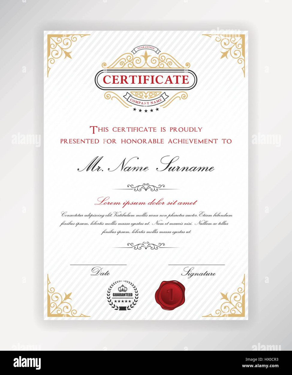
The size of a Certificate template is a crucial factor in determining its overall appearance and professionalism. A well-chosen size can enhance the readability, impact, and prestige of the certificate. This guide will delve into the key considerations for selecting the appropriate certificate template size and provide practical recommendations for achieving a professional and visually appealing design.
Paper Size

The foundation of certificate template size lies in the paper format used. Standard paper sizes like A4 (8.27 inches x 11.69 inches) and Letter (8.5 inches x 11 inches) are commonly used for certificates. However, depending on the specific requirements and desired aesthetic, other sizes like A3 (11.69 inches x 16.53 inches) or legal (8.5 inches x 14 inches) may be more suitable.
Orientation
The orientation of the certificate, either portrait (vertical) or landscape (horizontal), significantly impacts its overall layout and design. Portrait orientation is generally preferred for certificates with limited text and a focus on the recipient’s name and credentials. Landscape orientation, on the other hand, can accommodate more information or larger graphics.
Margins
Adequate margins are essential for creating a balanced and visually appealing certificate. The top, bottom, left, and right margins should be consistent and provide sufficient space for printing, framing, and handling. A common guideline is to use margins of at least 1 inch on all sides.
Text Size and Font
The size and font of the text on the certificate should be legible and complement the overall design. The recipient’s name, credentials, and issuing authority should be prominently displayed in a larger font size. Supporting text, such as the certificate number or date, can be smaller but still easily readable. Choose a font that is professional, clean, and easy to read. Serif fonts like Times New Roman or Garamond are often used for formal certificates, while sans-serif fonts like Arial or Helvetica can provide a more modern and contemporary look.
Graphics and Imagery
Graphics and imagery can add visual interest and enhance the impact of a certificate. However, it is important to use them judiciously and ensure they align with the overall theme and professionalism of the certificate. High-quality images and graphics that are relevant to the occasion or field of achievement can add value and prestige.
Layout and Composition
The layout and composition of the certificate should be well-structured and visually pleasing. The elements should be arranged in a logical manner, with clear divisions between different sections. Consider using a grid system to maintain consistency and balance.
Color Scheme
The color scheme of the certificate should be carefully chosen to convey the appropriate tone and message. A limited palette of colors can create a more sophisticated and professional look. Consider using colors that complement the institution’s branding or the nature of the award.
Additional Considerations
Printing Quality: Ensure the certificate is printed on high-quality paper using a professional printer to maintain a polished appearance.
By carefully considering these factors and incorporating them into your certificate template design, you can create a document that is both visually appealing and professionally impactful. A well-designed certificate will not only serve as a tangible recognition of achievement but also leave a lasting impression on the recipient.